Virtual Assistant Gem
Virtual Assistant Gem
Virtual Assistant Gem
Virtual Assistant Gem

Virtual Assistant Gem
Gemeente Rotterdam
Virtual Assistant Gem
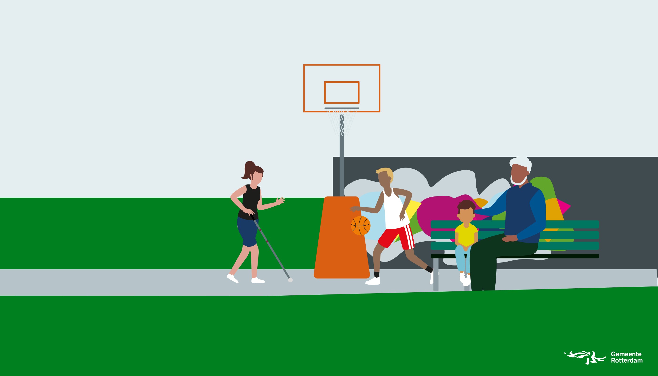
The municipality of Rotterdam offers digital assistance to residents and entrepreneurs with questions. This digital assistance is called the ‘virtual assistant Gem’. You can start a conversation with Gem via the chat button on our websites. The virtual assistant uses artificial intelligence (AI). AI helps Gem better understand residents and provide the correct information. Specifically, Gem uses supervised machine learning, where the best response to a question is calculated based on a library of possible answers.a
Client
Gemeente Rotterdam
Year
2023 - 2023
Services
Brand Identity
User Experience Design
No-code Development
Gemeente Rotterdam
Virtual Assistant Gem
The municipality of Rotterdam offers digital assistance to residents and entrepreneurs with questions. This digital assistance is called the ‘virtual assistant Gem’. You can start a conversation with Gem via the chat button on our websites. The virtual assistant uses artificial intelligence (AI). AI helps Gem better understand residents and provide the correct information. Specifically, Gem uses supervised machine learning, where the best response to a question is calculated based on a library of possible answers.a
Client
Gemeente Rotterdam
Year
2023 - 2023
Services
Brand Identity
User Experience Design
No-code Development
The challenge
The central challenge was to improve the virtual assistant GEM, which was implemented by the municipalities of Rotterdam, Utrecht, and Drechtsteden. The primary goal was to increase GEM’s ability to handle user inquiries independently, while ensuring it was accessible for all users, especially those with visual impairments. The current success rate of GEM was at 14%, and our aim was to enhance the user experience to raise this percentage, focusing on accessibility, usability, and inclusivity. Key objectives included: • Increasing accessibility for visually impaired users. • Expanding GEM’s capabilities to handle a wider range of user inquiries. • Improving user satisfaction through intuitive design.


The Solution
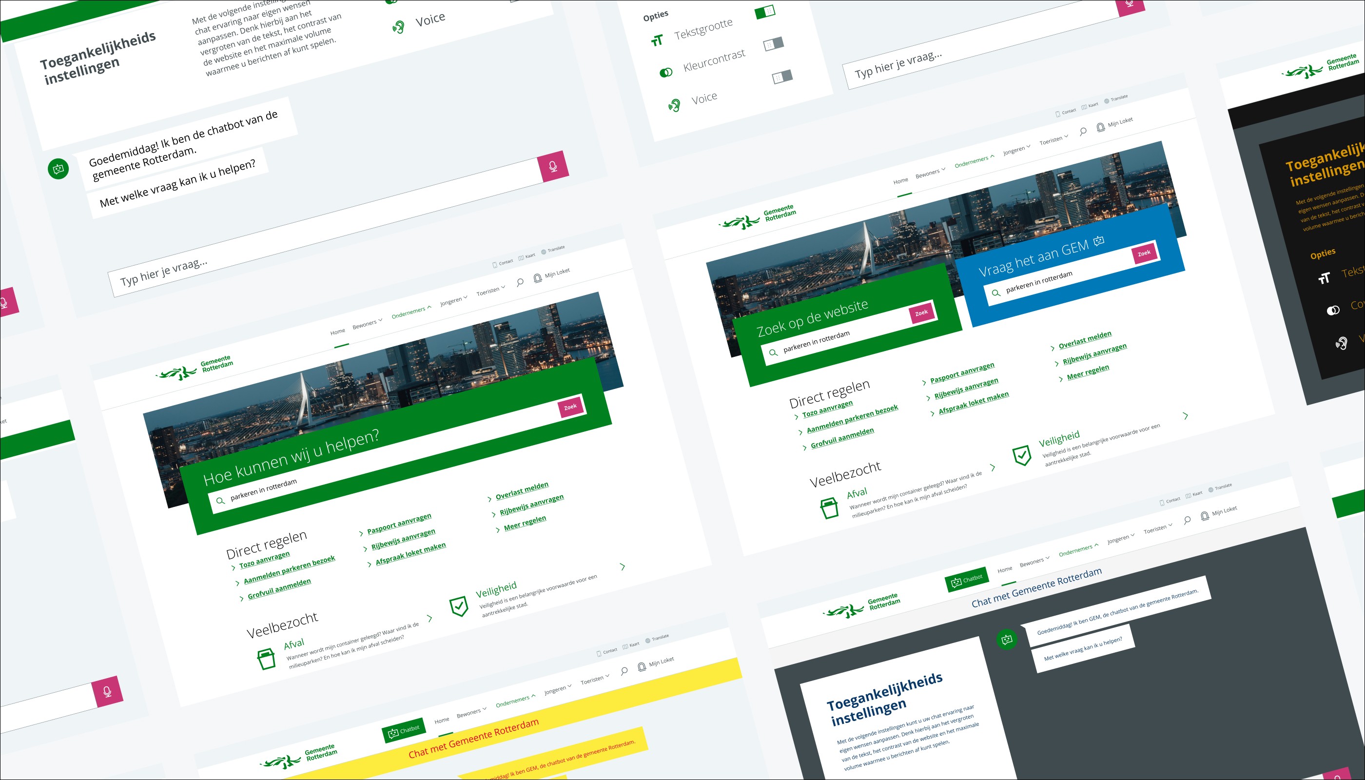
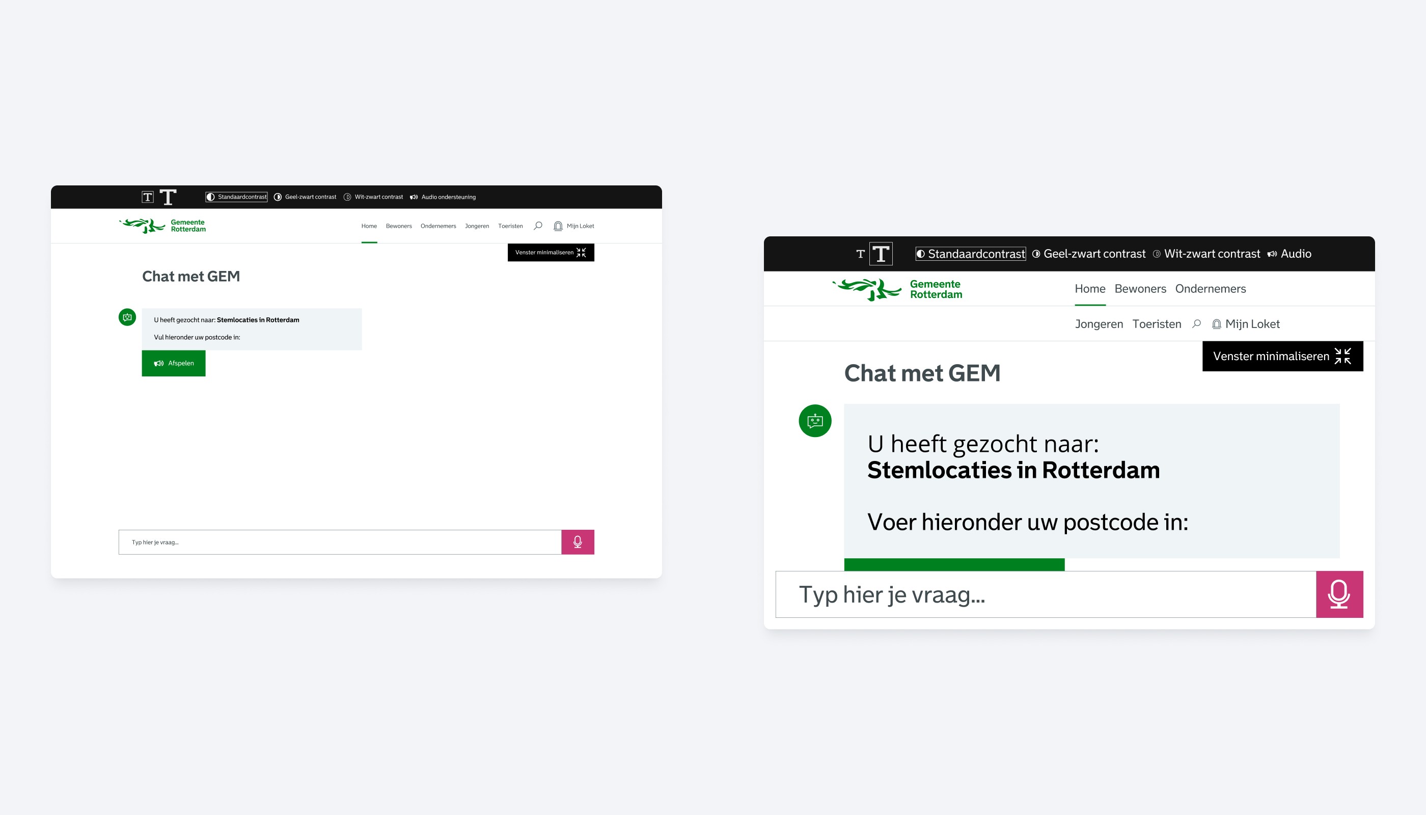
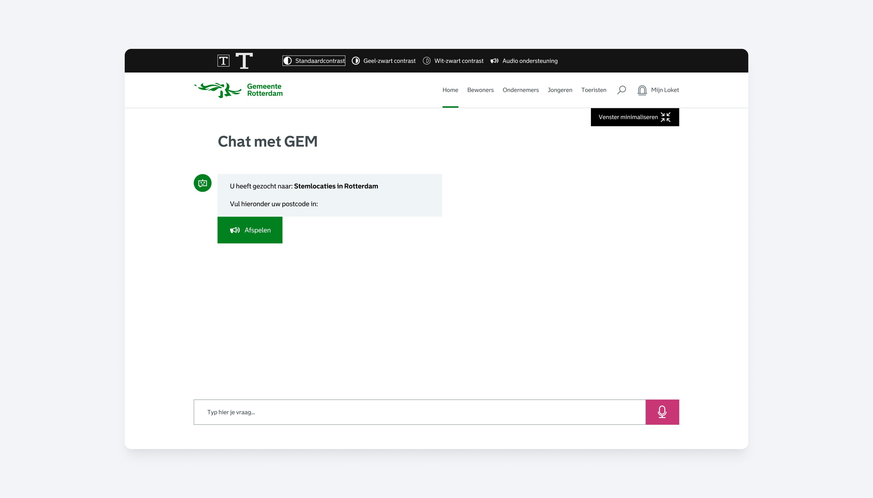
The final solution involved a comprehensive redesign of GEM, focusing on accessibility and usability. Key improvements included the implementation of high-contrast color schemes, customizable text sizes, and voice-over functionality. These features were integrated to ensure that visually impaired users could interact with GEM in a way that suited their needs. The design was focused on being intuitive and easy to use, allowing users to engage with municipal services without feeling dependent on human assistance. By making accessibility features highly visible and customizable, I ensured that users could adjust GEM to meet their specific needs, whether through visual enhancements or auditory feedback. This approach not only improved the user experience for individuals with visual impairments but also ensured that GEM was more efficient at handling user inquiries.
My role
As the lead designer in our team, which included Marck Fieret, Tim van Cappellen, and Milan Hamel, my primary responsibility was to guide the design direction of the Virtual Assistant Gem project for the Municipality of Rotterdam. Drawing from my expertise, I focused on ensuring accessibility for individuals with disabilities from a visual design perspective. To achieve this, I led the design of the GEM dashboard, incorporating high-contrast color schemes, customizable text sizes, and voice-over functionalities. These features were then implemented by the rest of the team in other modules of GEM.


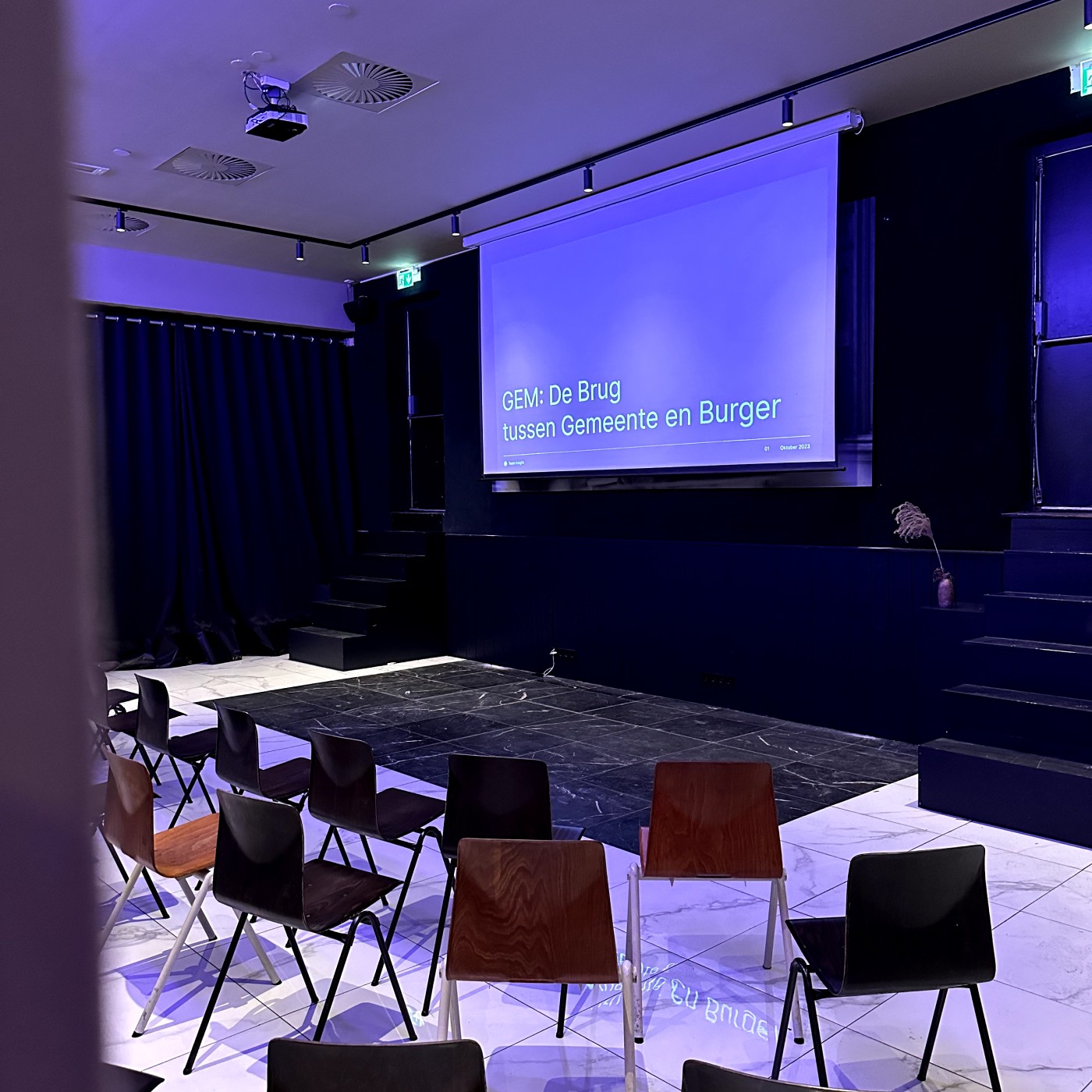
GEM: Presentation at De Rechtbank in Utrecht
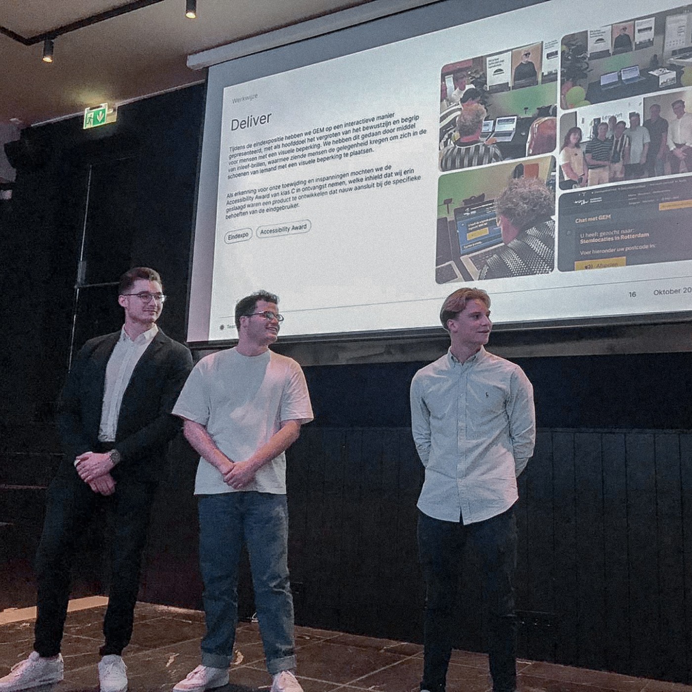
Our project was selected and even won an Accessibility Award, and when we were invited to present at GEM’s Half-Yearly Meeting, we knew it was an opportunity we couldn’t pass up. We took the stage at De Rechtbank in Utrecht, sharing the work we’d been working in from September 2022 to June 2023. This project was about exploring the challenges that visually impaired users face in digital environments. Our presentation covered everything from the initial problem statement to understanding our target audience, the process we followed, and the most valuable insights we uncovered. At the heart of our message was a simple, but powerful idea: empathy is everything. We stressed the importance of going beyond assumptions and engaging in genuine conversations with users. Time and again, we found that what we thought we knew about our audience didn’t match their actual experiences. This reinforced a lesson we hold close: true user-centric design only happens when you dive deep into the perspectives of those you’re designing for. Throughout the project, our approach was iterative. We conducted user interviews, built prototypes, tested, learned, and repeated. This continuous feedback loop allowed us to adapt and refine our designs to better serve the needs of the visually impaired. The insights gained were not only eye-opening but also practical—leading to design choices that made a real difference. The feedback from our presentation was encouraging, reminding us just how critical this kind of work is. The takeaway we left with the audience was clear: you can’t design meaningful experiences without first listening deeply and building genuine empathy.


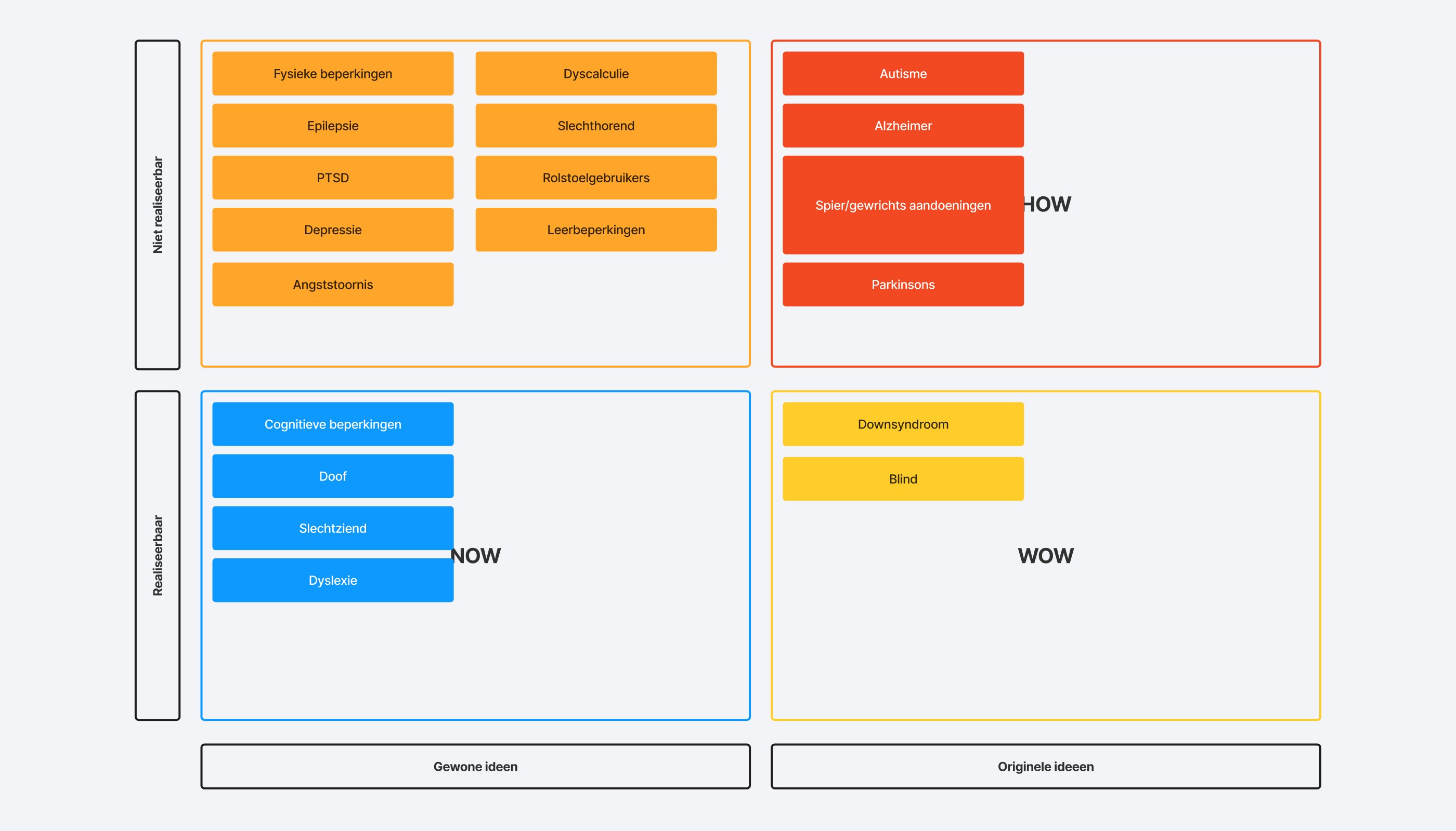
MoSCoW
To effectively prioritize the numerous design improvements, I utilized the MoSCoW framework, which allowed us to categorize features based on their importance: Must Haves: These included features like always-accessible accessibility settings, customizable text sizes, and high-contrast themes. Should Haves: These were features that could significantly improve the experience but were not essential, such as enhancing the onboarding process. Could Haves: These were additional features like responsive design for mobile and tablet users, which were beneficial but not critical for this iteration. Won’t Haves: We identified elements that were either too time-consuming or out of the project’s immediate scope, such as complex AI-driven functionalities. Using this framework helped focus our development efforts on the features that would have the greatest impact on the user experience while balancing resource constraints.


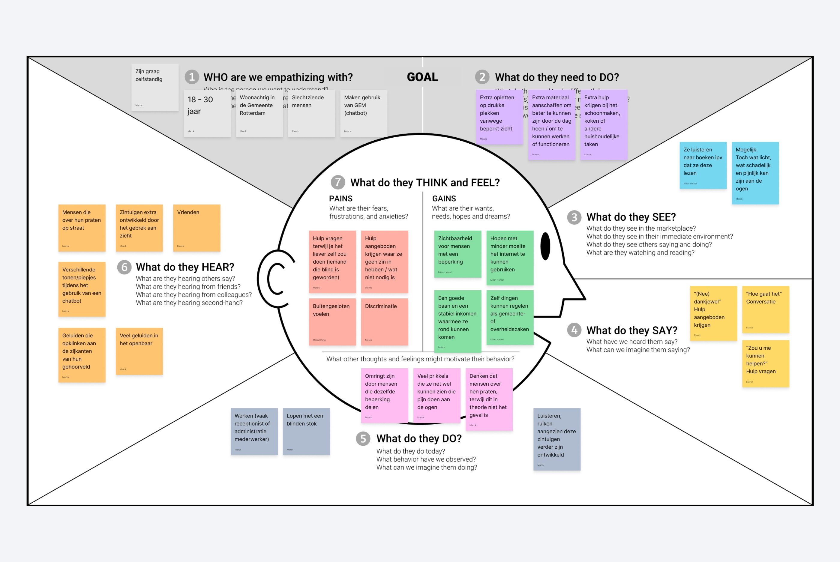
Empathy Map
Prioritization of Accessibility: We integrated high-contrast color schemes into GEM’s visual design. This feature was chosen specifically to help visually impaired users distinguish interface elements more clearly. This design choice stemmed directly from understanding the need for better visibility through our empathy research. Customization Features: Recognizing that accessibility needs vary widely, we incorporated customizable text sizes. The empathy map revealed that users wanted the ability to modify their experience to suit their specific preferences, ensuring that they could interact with GEM in a way that was comfortable and effective for them. Voice-Over Functionalities: The research emphasized that many visually impaired users rely on their auditory senses for navigation and comprehension. Based on this, we integrated voice-over functionalities and voice command options into GEM. This design choice enabled users to navigate the platform and access services without the need for visual engagement, significantly enhancing usability for blind users or those who preferred auditory interfaces.


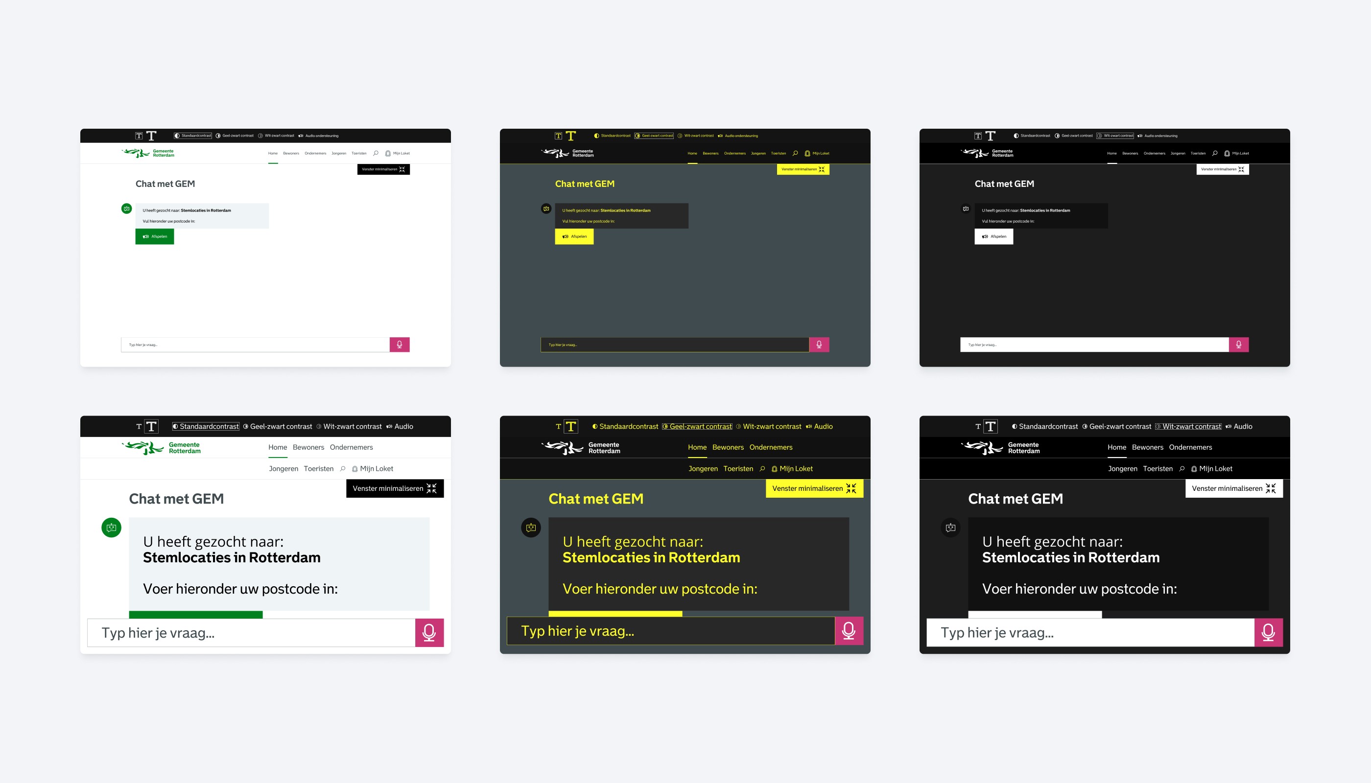
Prototype 1.0
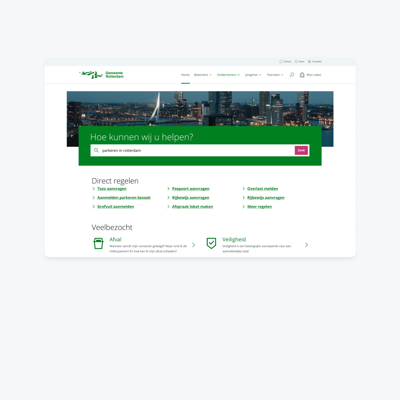
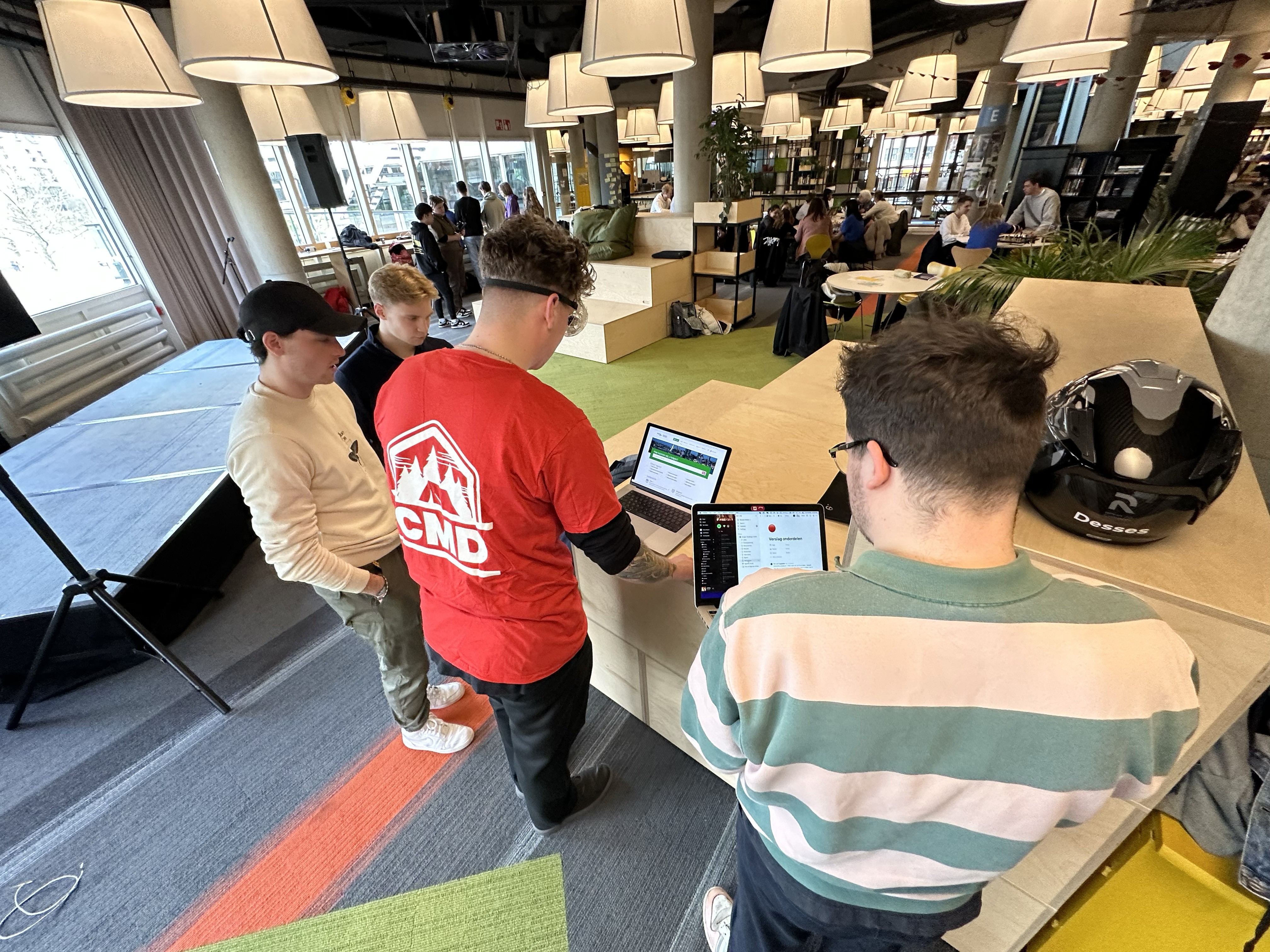
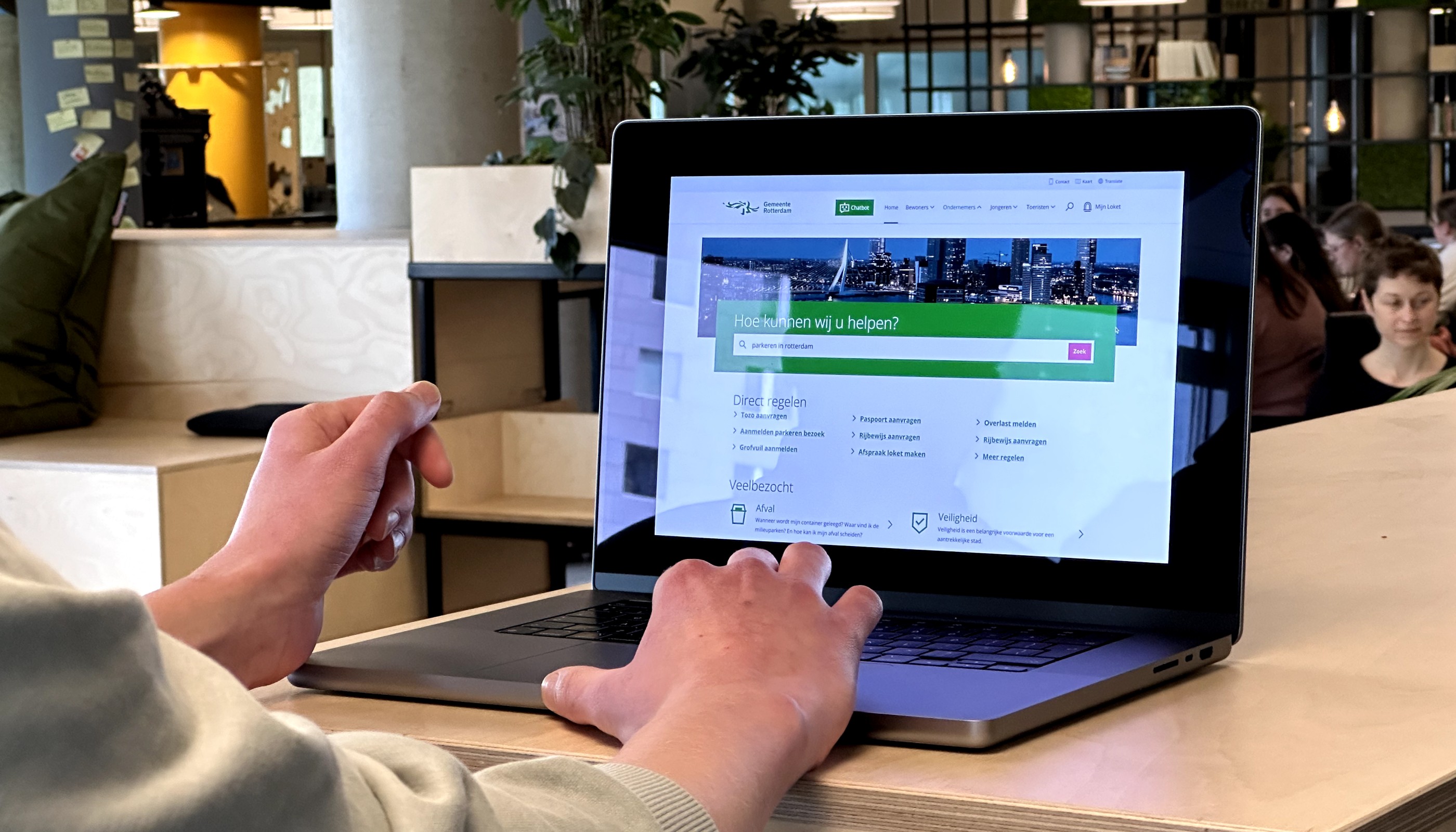
In the first prototype, we focused on implementing the core accessibility features needed to make GEM more usable for visually impaired users. This included high-contrast color schemes, customizable text sizes, and an onboarding flow that introduced these features upfront. The aim was to ensure that users could adjust settings according to their preferences as soon as they interacted with GEM. During the first round of user testing, feedback from visually impaired users revealed important insights. Many users found the white background to be too harsh on the eyes, and there was a clear preference for higher contrast color combinations. This feedback led to key adjustments in the next iteration, such as enhancing the color palette and improving button labeling to make the interface more intuitive.






Prototype 2.0
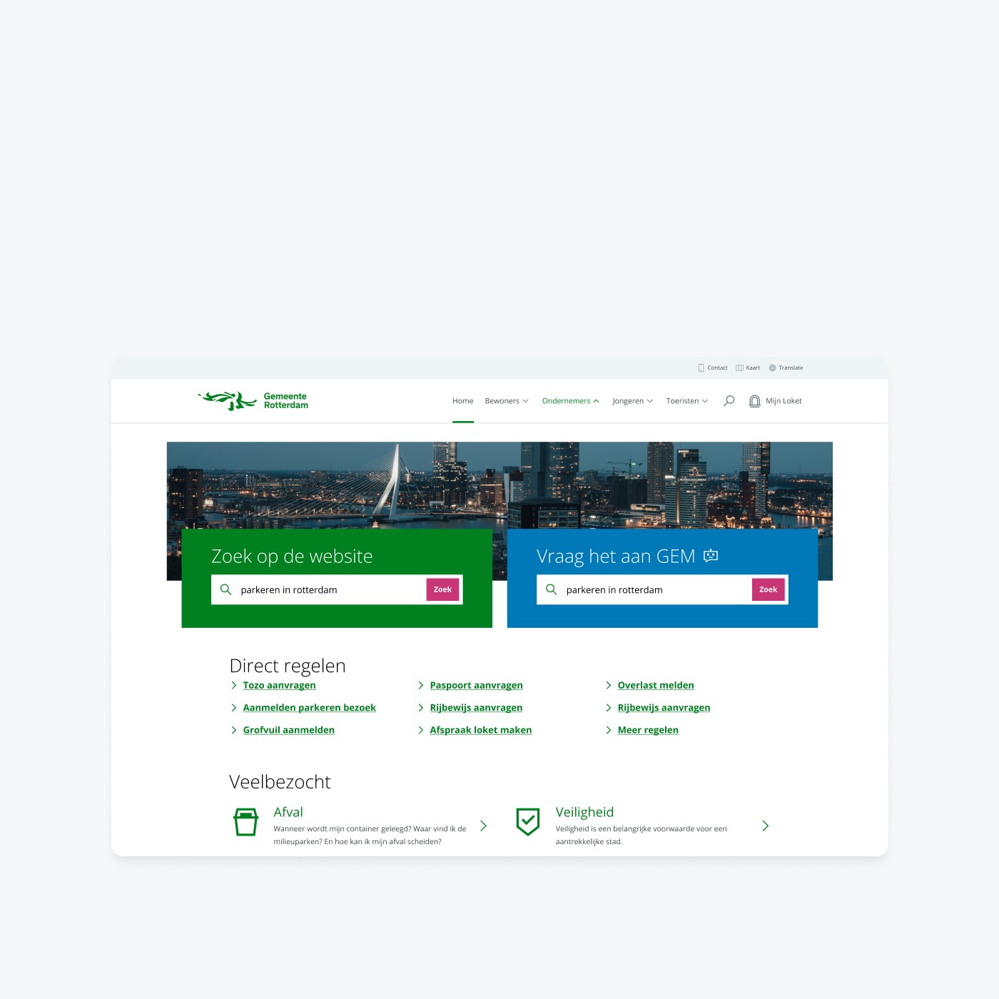
The second prototype built upon the feedback gathered from the initial testing phase. We refined the accessibility settings, ensuring they were more prominent and accessible throughout the entire user journey. I also improved the interaction flow with GEM by making responses and prompts more tailored and intuitive. Audio feedback was introduced, giving users clear auditory confirmation for actions such as button presses. This iteration was also designed to work across multiple devices, with a focus on making the interface responsive for mobile and tablet users. Although limited time meant we could not fully implement all mobile-specific features, we explored how GEM could be adapted for smaller screens to maintain accessibility across platforms. The second prototype was tested with visually impaired users again, and the feedback was highly positive. Users appreciated the improved layout, clearer navigation, and added auditory feedback. This iteration laid the foundation for the final version of GEM, which was more accessible, user-friendly, and efficient in handling user inquiries.




See other projects from the portfolio
See other projects from the portfolio
Ready for lift-off?
contact@desses.co
Feel free to reach out if you want to start a project, collaborate, or simply have a chat.
FRAMER
PARTNER
FRAMER
EXPERT
—
VAT: NL002528092B50
—
KVK: 71601112
Ready for lift-off?
contact@desses.co
Feel free to reach out if you want to start a project, collaborate, or simply have a chat.
FRAMER
PARTNER
FRAMER
EXPERT
—
VAT: NL002528092B50
—
KVK: 71601112
Ready for lift-off?
contact@desses.co
Feel free to reach out if you want to start a project, collaborate, or simply have a chat.
FRAMER
PARTNER
FRAMER
EXPERT
VAT: NL002528092B50
KVK: 71601112
Ready for lift-off?
contact@desses.co
Feel free to reach out if you want to start a project, collaborate, or simply have a chat.
FRAMER
PARTNER
FRAMER
EXPERT
—
VAT: NL002528092B50
—
KVK: 71601112

