
Number one in Battery Storage Systems
Number one in Battery Storage Systems
Number one in Battery Storage Systems
Number one in Battery Storage Systems

Number one in Battery Storage Systems
ChargeBlock
Number one in Battery Storage Systems
ChargeBlock is a company based in the Netherlands that focuses on energy storage solutions, particularly through advanced battery systems. Their primary products are home batteries and battery containers, designed to store excess energy from solar panels or the electrical grid. These solutions allow both households and businesses to become more energy-efficient, reducing dependency on the energy grid and lowering costs by storing and using energy when needed.
Client
ChargeBlock
Year
2021 - 2024
Services
Brand Identity
User Experience Design
No-code Development
ChargeBlock
Number one in Battery Storage Systems
ChargeBlock is a company based in the Netherlands that focuses on energy storage solutions, particularly through advanced battery systems. Their primary products are home batteries and battery containers, designed to store excess energy from solar panels or the electrical grid. These solutions allow both households and businesses to become more energy-efficient, reducing dependency on the energy grid and lowering costs by storing and using energy when needed.
Client
ChargeBlock
Year
2021 - 2024
Services
Brand Identity
User Experience Design
No-code Development
The challenge
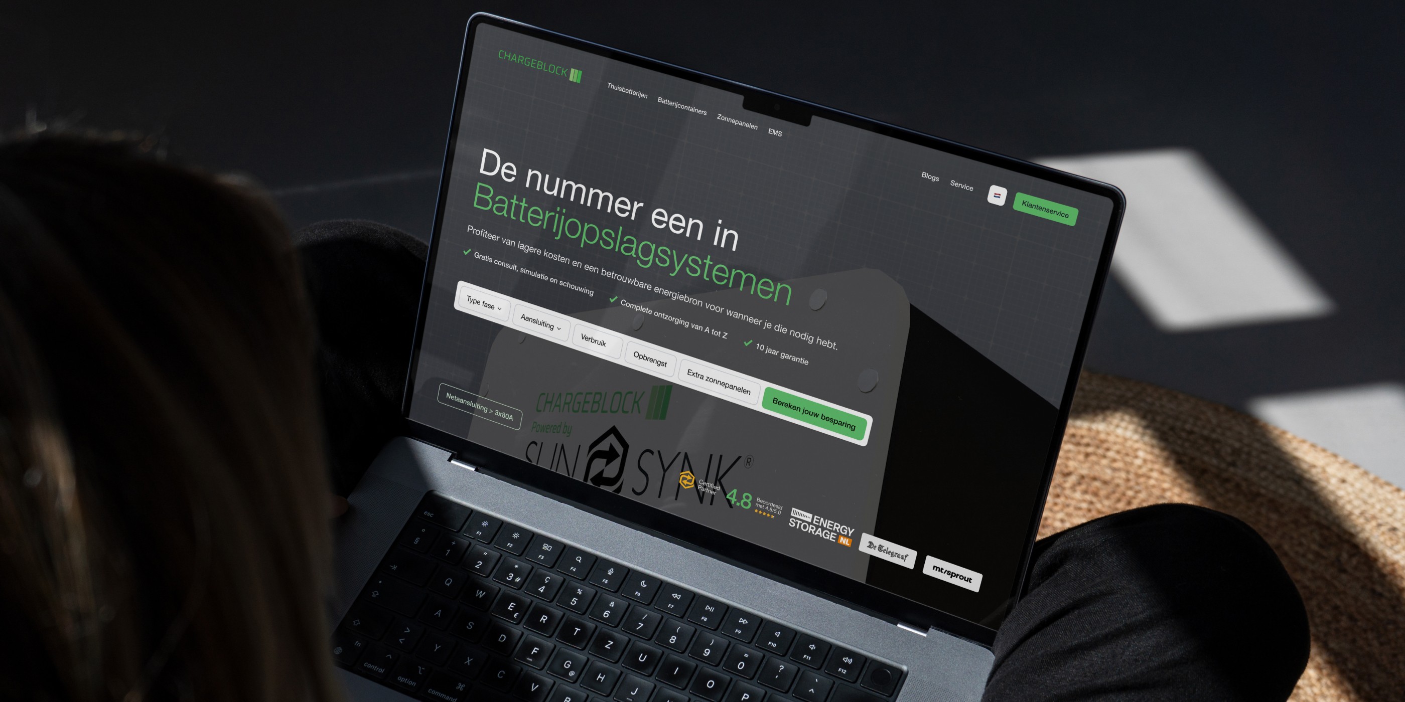
The homepage didn’t clearly communicate what ChargeBlock stood for or why visitors should care. Without a strong tagline or engaging visuals, users weren’t drawn in or motivated to explore further. The structure of the site was also hard to navigate. It didn’t offer clear pathways for different user groups, like residential and industrial customers, which made it difficult for them to find relevant information. Products such as home batteries and battery containers weren’t explained in a way that made their differences or use cases clear, leaving users confused. The overall design felt outdated and didn’t reflect the professional and innovative image ChargeBlock wanted to portray. Inconsistent spacing, poor layout structure, and a lack of visual clarity made the site feel cluttered and harder to navigate. This left users feeling overwhelmed rather than confident in the brand.


My role
My primary task was to redesign the ChargeBlock website to address key usability issues, cater to diverse audiences, and create a design that reflects the brand’s professionalism and innovation. The project started with an in-depth analysis of the existing site, where I identified several challenges: unclear messaging on the homepage, a lack of clear user pathways for residential and industrial clients, and an outdated design that didn’t inspire trust or confidence. To tackle these issues, I developed a user-centered design strategy that focused on creating distinct user journeys for both residential and industrial clients. For residential users, the goal was to simplify and clarify the experience. I designed wireframes and prototypes that prioritized accessible information and easy navigation. Homeowners needed to immediately understand the benefits of ChargeBlock’s products, so I emphasized clear messaging supported by visuals that explained savings, efficiency, and environmental impact. For industrial clients, the challenge was to present more in-depth technical content in a way that was easy to navigate. I designed pages that highlighted detailed product specifications, case studies, and ROI calculators. This allowed industrial users to dive into technical details without being overwhelmed or distracted by irrelevant content. Another critical part of the redesign was addressing the site’s mobile experience. The old site performed poorly on mobile devices, so I adopted a mobile-first design approach. With increasing mobile traffic, especially among residential users, I streamlined the design to ensure a seamless experience on smaller screens. Navigation, layouts, and CTAs were optimized for mobile devices, making the site intuitive and responsive. Additionally, I implemented a scalable design system to future-proof the website. This included reusable design elements such as typography, color schemes, icons, and layout structures. This system ensures ChargeBlock can grow and adapt its online presence efficiently as the company evolves. While the website redesign was the primary focus, the rebranding effort was just as important. ChargeBlock’s old branding failed to reflect its innovative and professional image. The new brand identity was designed to communicate ChargeBlock’s cutting-edge solutions while appealing to a broad audience. It successfully balanced bold, technical visuals for industrial users with softer, approachable tones for homeowners, creating a cohesive and modern identity.


Brand Identity
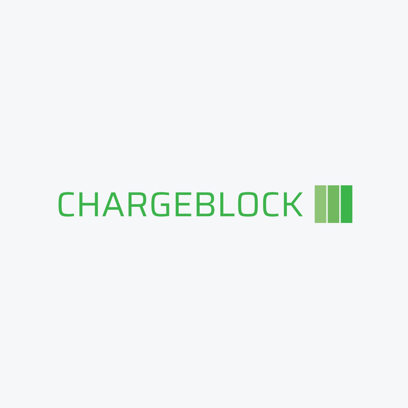
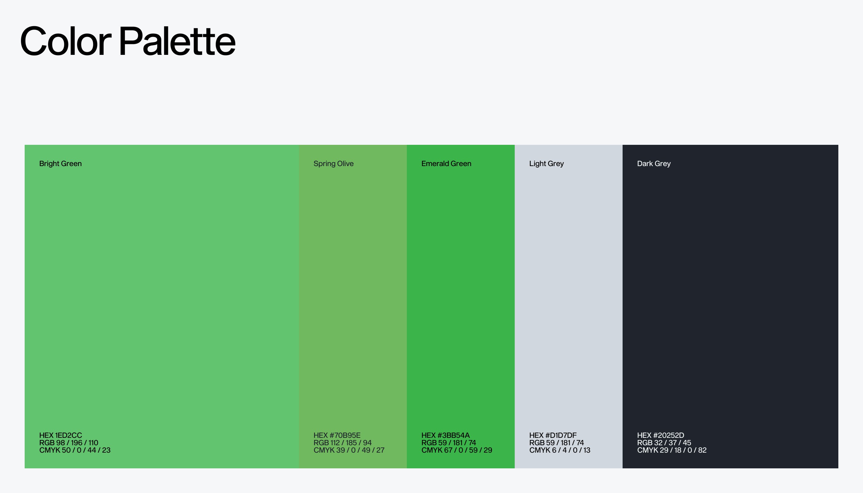
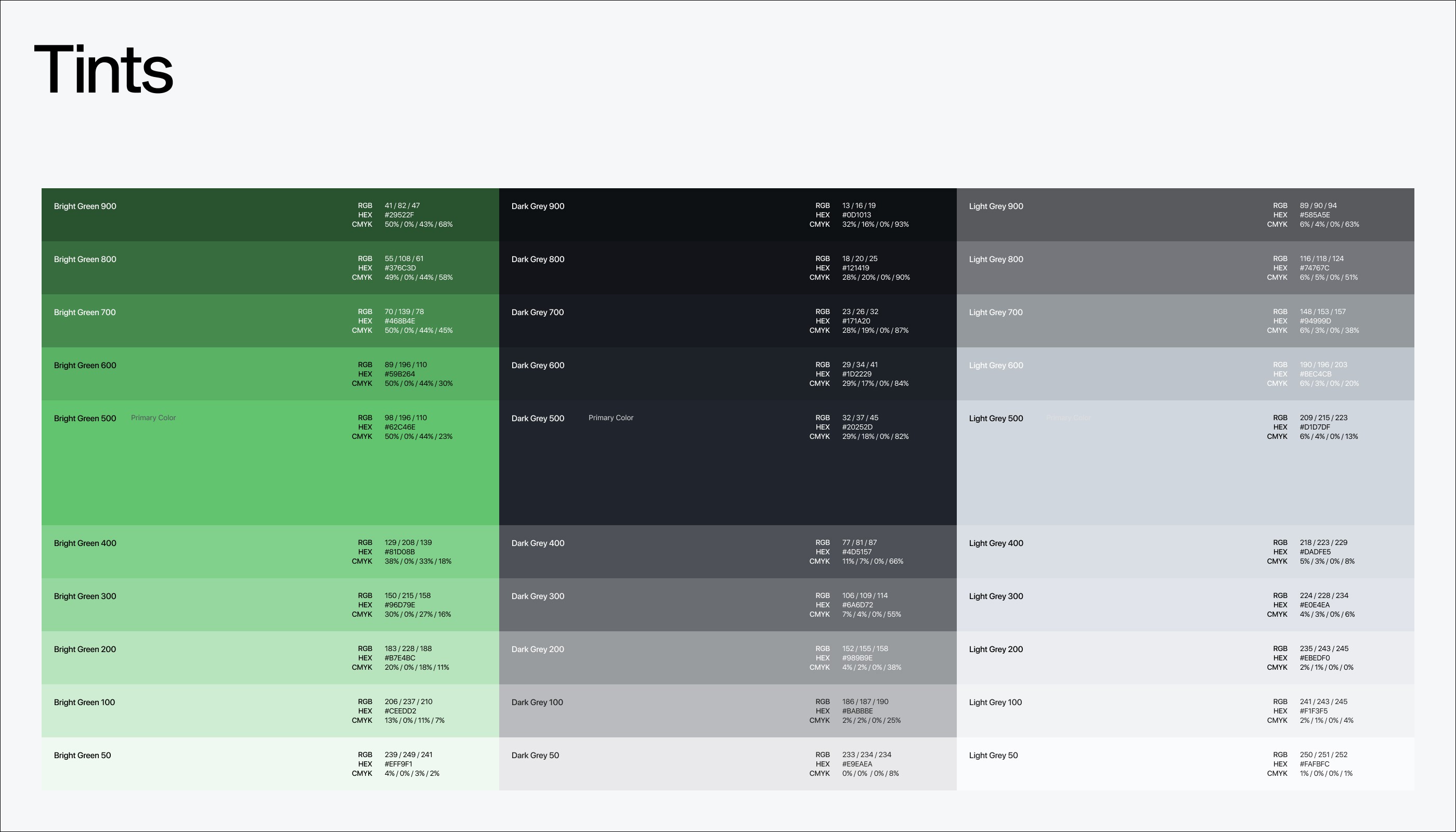
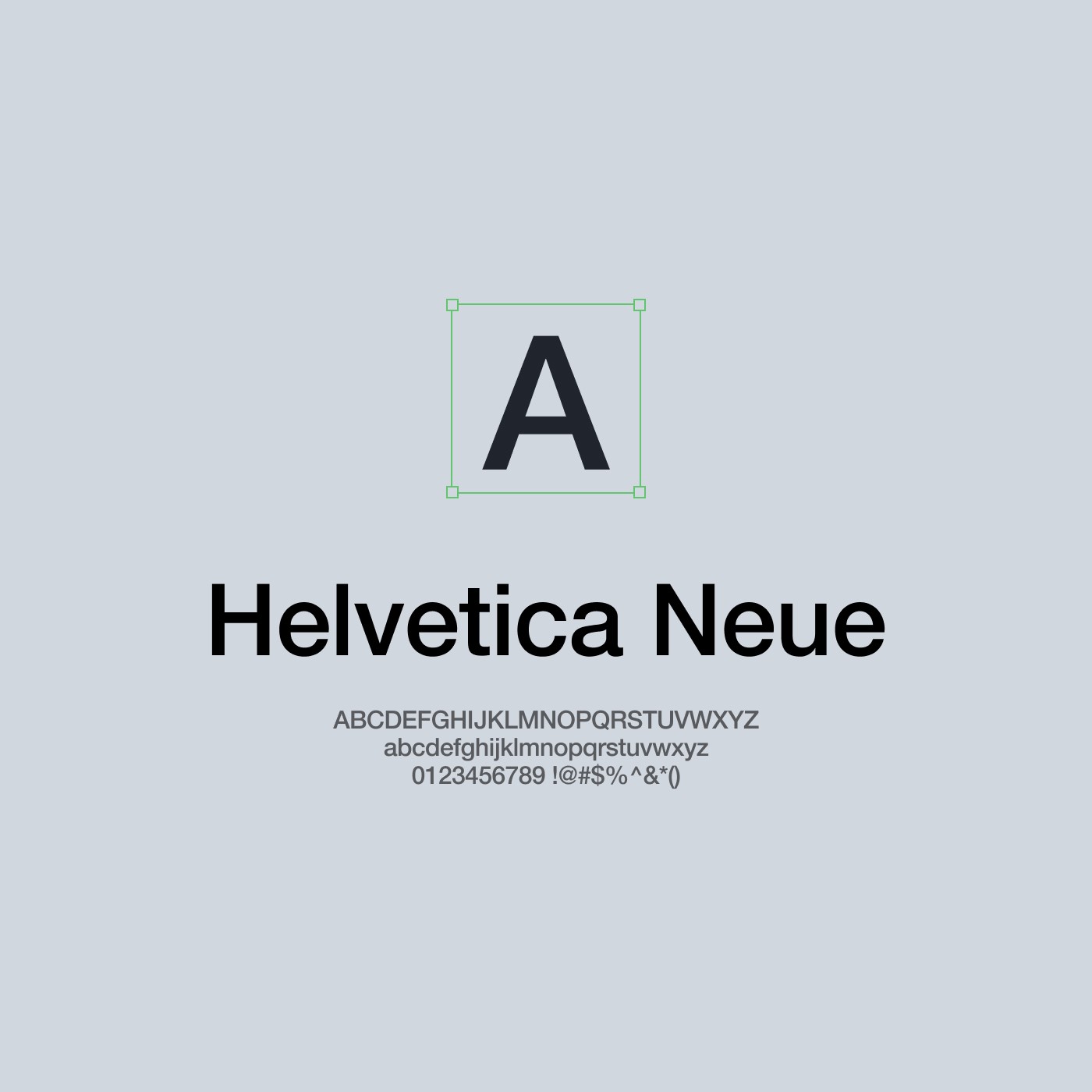
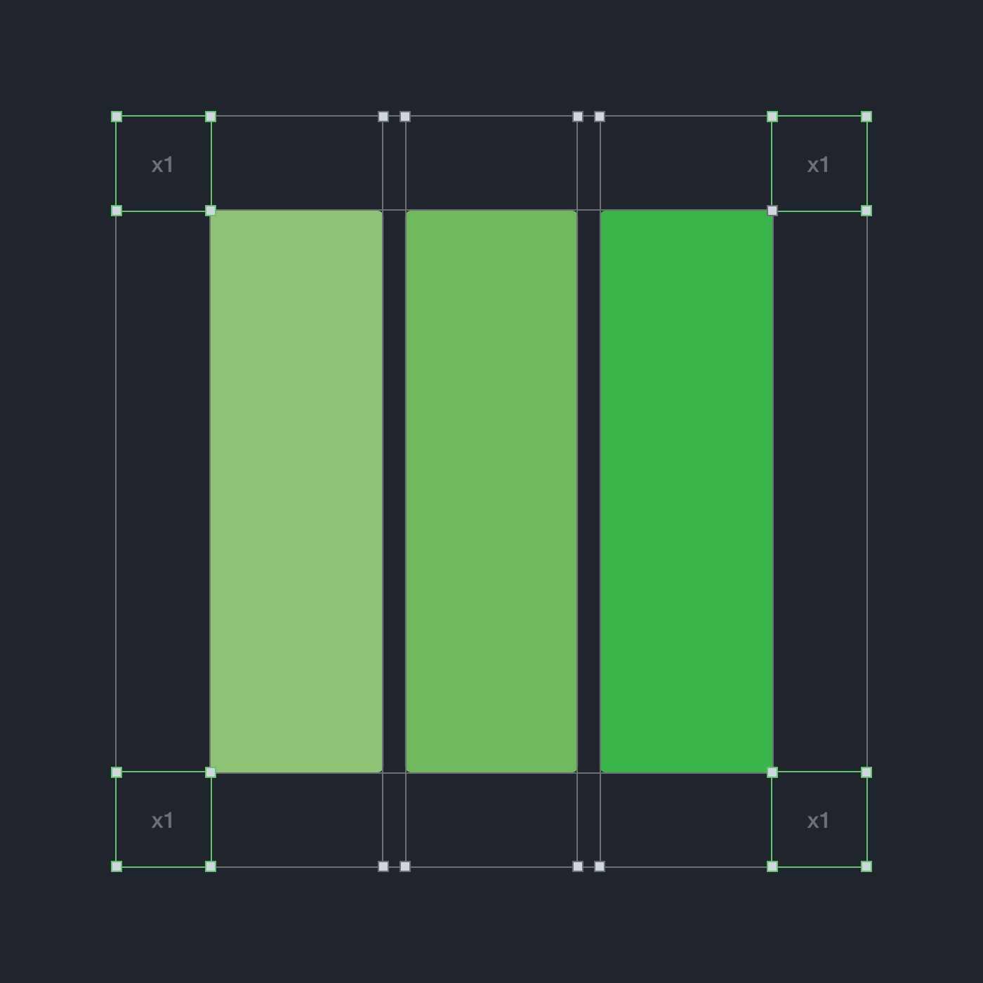
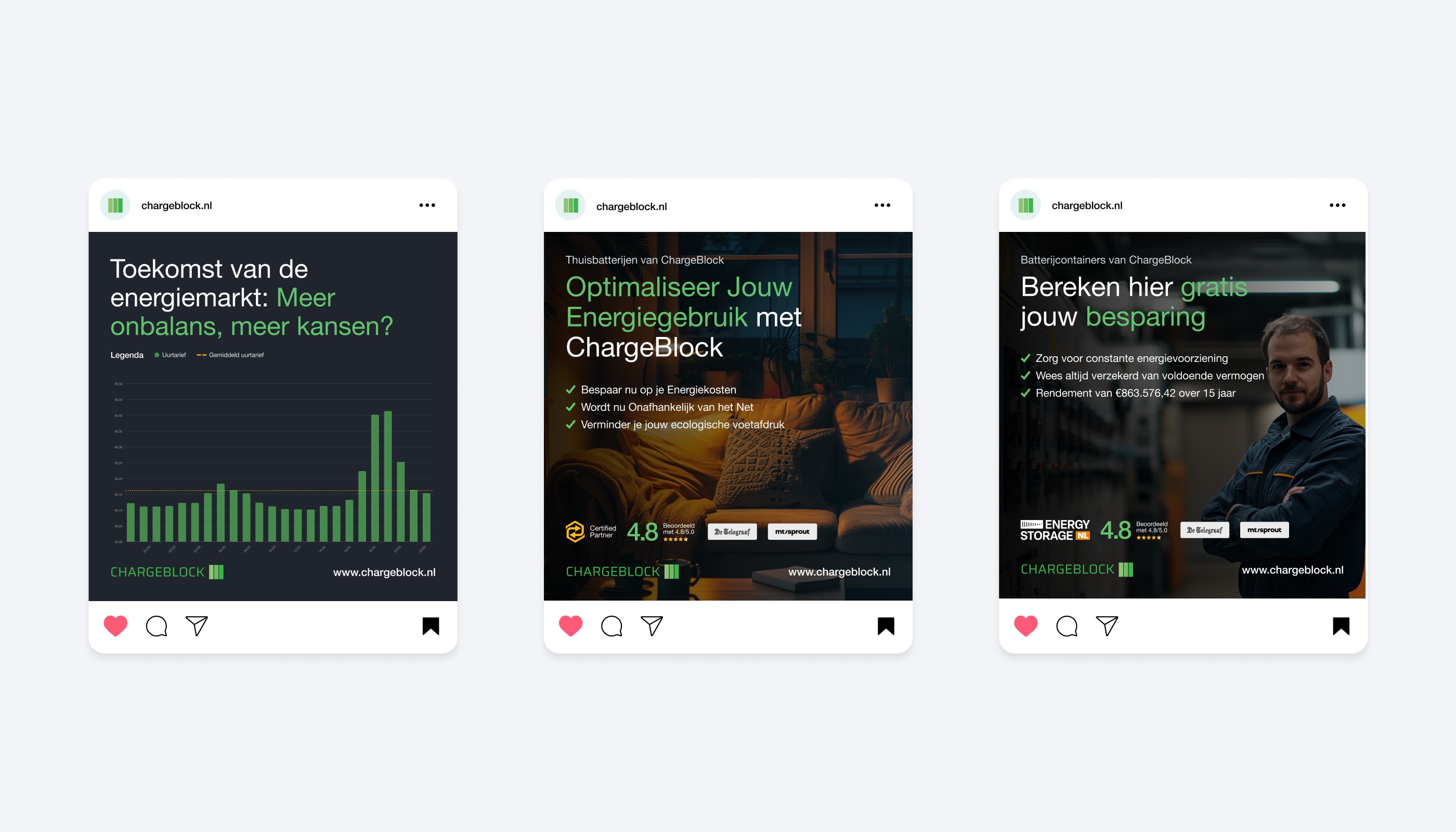
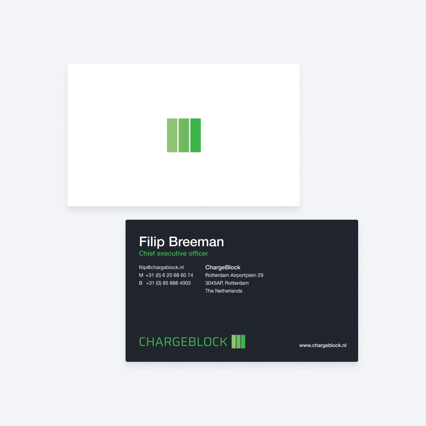
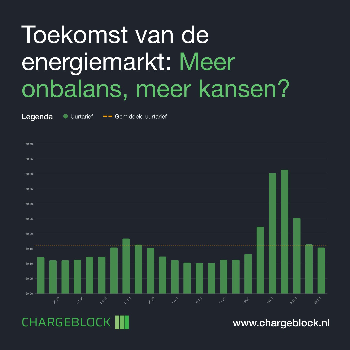
When I took on the project to rebrand ChargeBlock, I knew it would be a challenge that required more than just a new logo or color palette. ChargeBlock operates in a highly competitive market—the renewable energy sector—where companies are constantly trying to stand out. My task was to create a brand identity that not only reflected ChargeBlock’s innovative technology but also appealed to a wide audience, from environmentally conscious homeowners to large industrial businesses. One of the first issues I encountered was the difficulty of standing out in such a competitive market. ChargeBlock’s technology was superior, but their visual identity and messaging didn’t reflect that. To solve this, I designed a modern, minimalist logo that symbolized both energy flow and storage, ensuring it was clean and approachable while still hinting at the cutting-edge technology behind the brand. The color palette played a significant role here as well. By combining natural greens and energy blues, I created a balance between sustainability and innovation, helping ChargeBlock differentiate itself visually.















UX Design
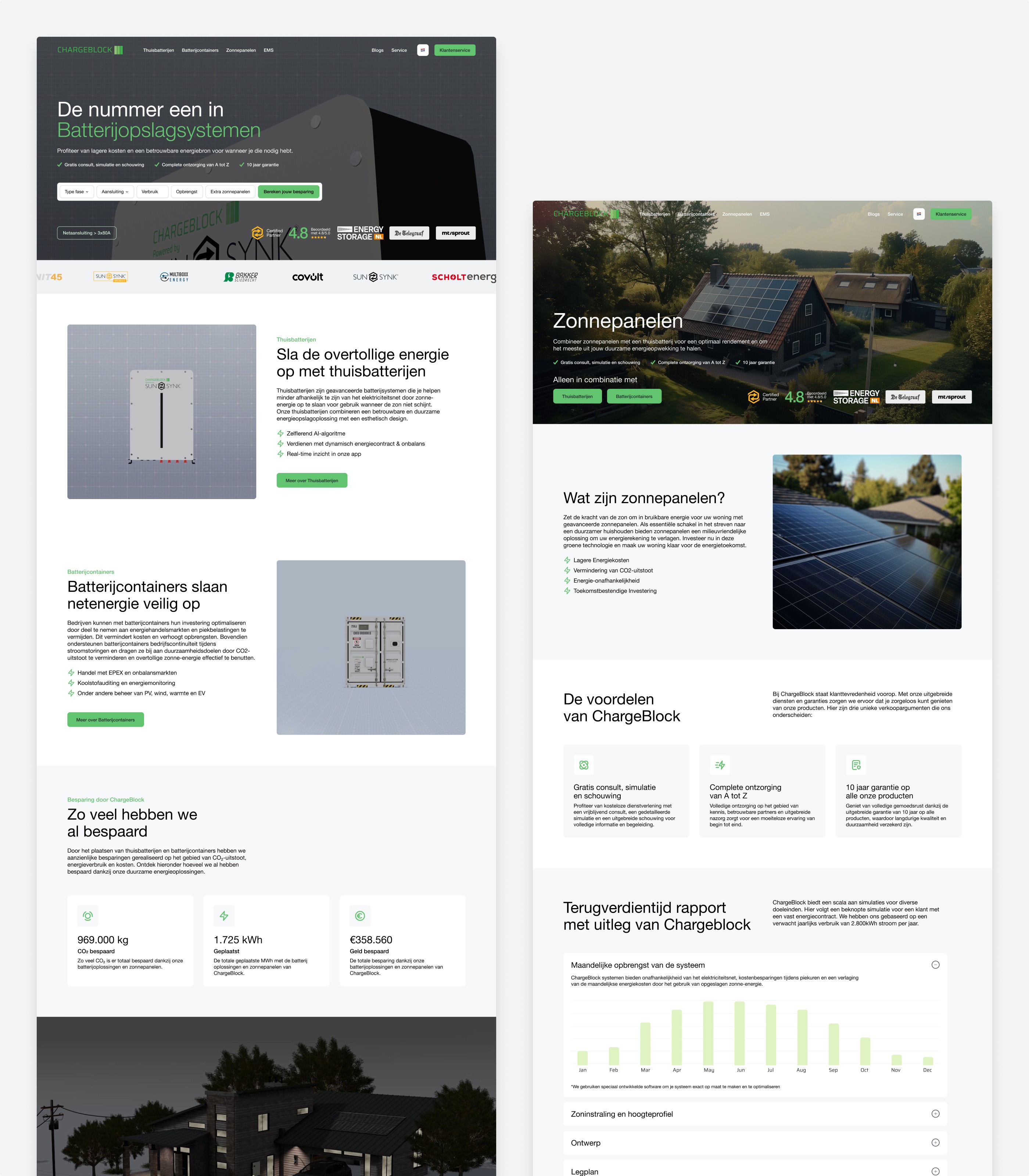
The UX/UI design of the new ChargeBlock website needed to reflect the brand’s values of trust, innovation, and sustainability while catering to the needs of a diverse audience. The primary goal was to create an intuitive, user-friendly experience that seamlessly served both residential (B2C) and industrial (B2B) audiences. To achieve this, the website was designed to segment users from the outset. Dedicated landing pages were created for each audience group, presenting information tailored to their specific needs. For residential users, this included clear explanations of home battery solutions, highlighting benefits like cost savings, efficiency, and environmental impact. For industrial users, pages focused on detailed product specifications, use cases, and ROI calculators to address their more technical requirements. This segmentation reduced the complexity of navigation and ensured that users could quickly find the information most relevant to them. At the same time, the design prioritized simplicity and ease of use. Key features, such as an interactive savings calculator, were integrated into the user experience. This tool allowed potential customers—particularly homeowners—to see real-time benefits of ChargeBlock’s solutions, encouraging engagement and building trust in the brand. A mobile-first approach was central to the UX strategy. Recognizing the increasing number of users accessing the site via smartphones, the design was optimized for responsiveness, ensuring smooth navigation and fast load times on all devices. Whether viewed on a desktop, tablet, or smartphone, the site offered a seamless experience, helping ChargeBlock meet the needs of a growing and diverse customer base.


Design System
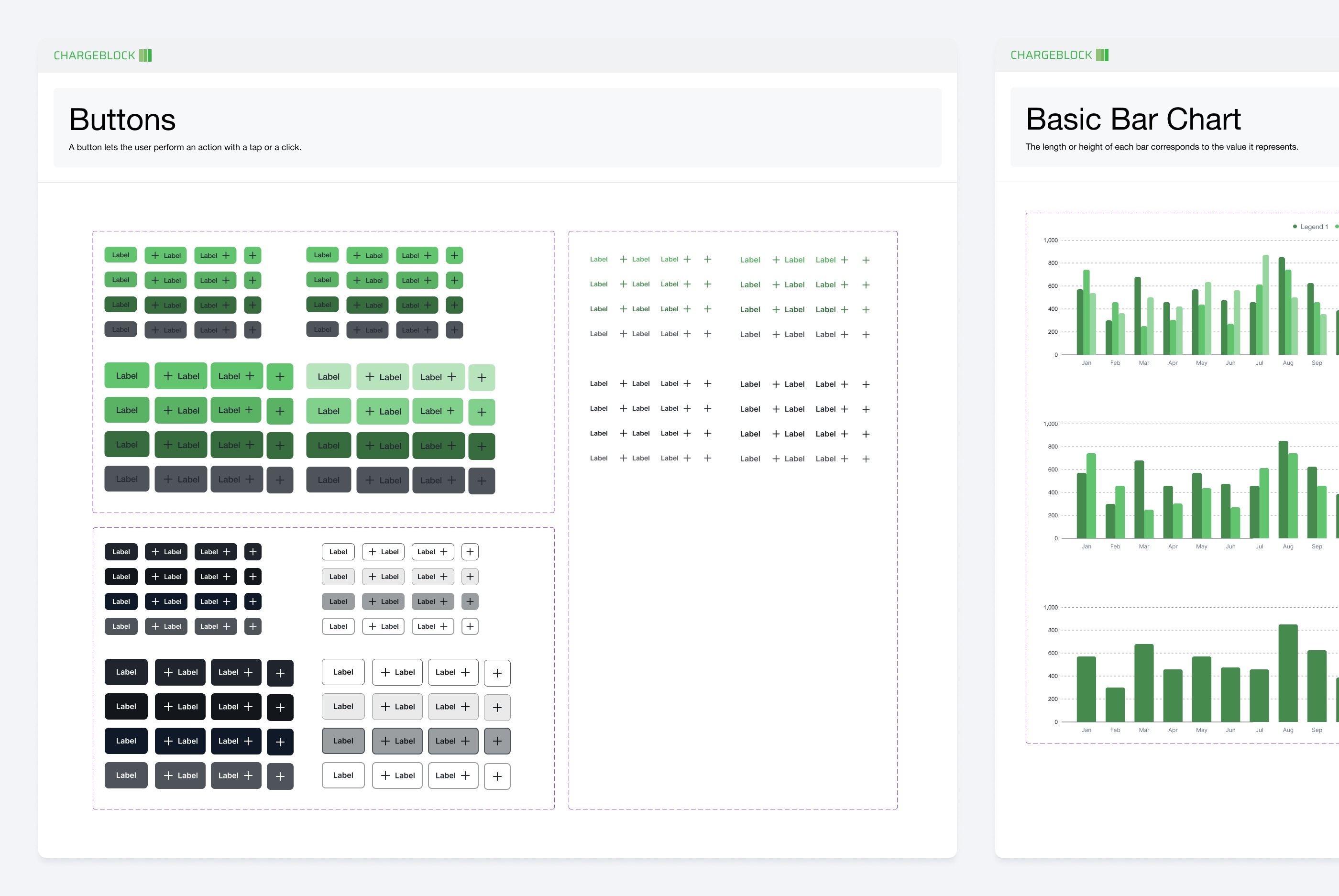
As part of ChargeBlock’s rebranding, creating a robust design system was essential not only to maintain visual consistency but also to support the brand’s future growth, especially as its online presence expanded. ChargeBlock had ambitious plans to scale, and the design system had to be adaptable to accommodate this growth without compromising the brand’s identity or user experience. I developed a flexible and scalable design system that could evolve with ChargeBlock as it entered new markets and expanded its product offerings, ensuring that the brand could maintain its impact across all touchpoints. At the core of this system was a carefully curated set of design elements—typography, color schemes, iconography, and imagery—that could be applied consistently across all platforms, from the website to product packaging and marketing materials. These elements were designed to be flexible enough to grow with the brand, allowing ChargeBlock to expand its online presence, launch new products, and enter new markets without needing to overhaul its visual identity.


Website
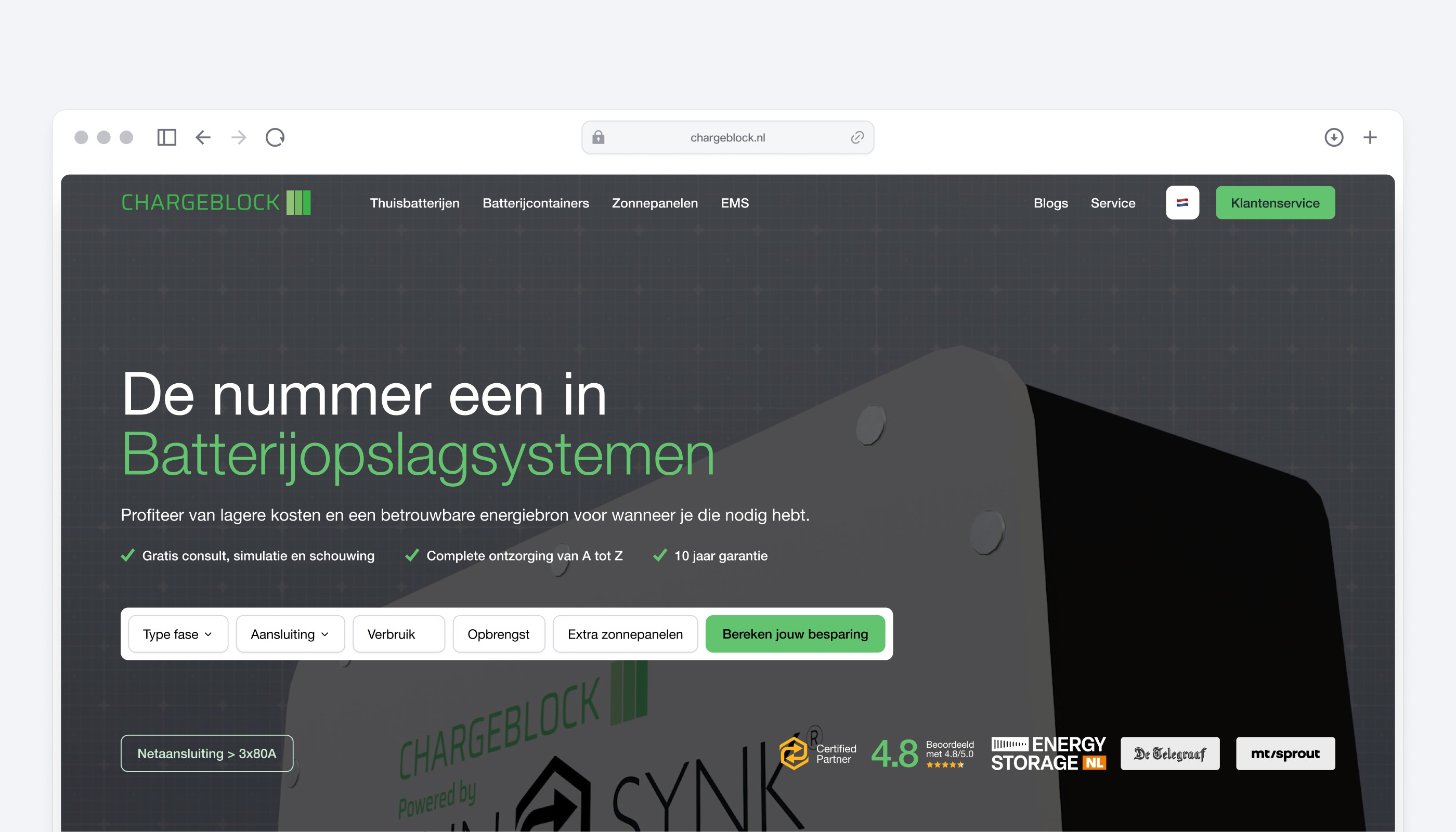
Redesigning ChargeBlock’s website presented a significant challenge: serving two distinct audiences with vastly different needs. Residential customers were looking for approachable and easy-to-understand home battery solutions, while industrial clients required in-depth technical details about large-scale energy storage. The site needed to balance these priorities while also being flexible and scalable to accommodate ChargeBlock’s future growth and evolving product offerings. One early insight from user testing was the unexpected importance of the savings calculator. Initially positioned as a supplementary feature, it quickly became apparent that this tool was driving significant engagement, particularly among residential users. Homeowners valued the ability to immediately calculate potential energy savings, as it made the product benefits tangible and accessible. Based on this feedback, I repositioned the calculator prominently on the homepage, transforming it into one of the site’s standout features. Another surprising discovery came from analyzing mobile engagement. While I initially assumed industrial clients would primarily use desktops for accessing detailed product specifications, user analytics revealed that many were using smartphones. This highlighted the importance of creating a fully optimized mobile experience. Adopting a mobile-first approach, I ensured the site was responsive, intuitive, and fast-loading across all devices. This design choice benefited both residential and industrial users, who increasingly relied on mobile for on-the-go access. Through these refinements, the redesigned website now serves as a flexible, user-centered platform that meets the unique needs of both residential and industrial audiences. It also provides a strong foundation for ChargeBlock’s future growth, with scalability built into its design to accommodate new products and markets.

Evidence
+966%
More website views within one year
41K
Total website visitors in 2024
2021
Founded date
Evidence
+966%
More website views within one year
41K
Total website visitors in 2024
2021
Founded date
See other projects from the portfolio
See other projects from the portfolio
Ready for lift-off?
contact@desses.co
Feel free to reach out if you want to start a project, collaborate, or simply have a chat.
FRAMER
PARTNER
FRAMER
EXPERT
—
VAT: NL002528092B50
—
KVK: 71601112
Ready for lift-off?
contact@desses.co
Feel free to reach out if you want to start a project, collaborate, or simply have a chat.
FRAMER
PARTNER
FRAMER
EXPERT
—
VAT: NL002528092B50
—
KVK: 71601112
Ready for lift-off?
contact@desses.co
Feel free to reach out if you want to start a project, collaborate, or simply have a chat.
FRAMER
PARTNER
FRAMER
EXPERT
VAT: NL002528092B50
KVK: 71601112
Ready for lift-off?
contact@desses.co
Feel free to reach out if you want to start a project, collaborate, or simply have a chat.
FRAMER
PARTNER
FRAMER
EXPERT
—
VAT: NL002528092B50
—
KVK: 71601112

